Research & Learning
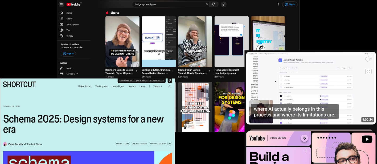
Explored design system best practices through articles, tutorials, and videos to understand component structures and scalable design workflows.
Brand Identity & Experience
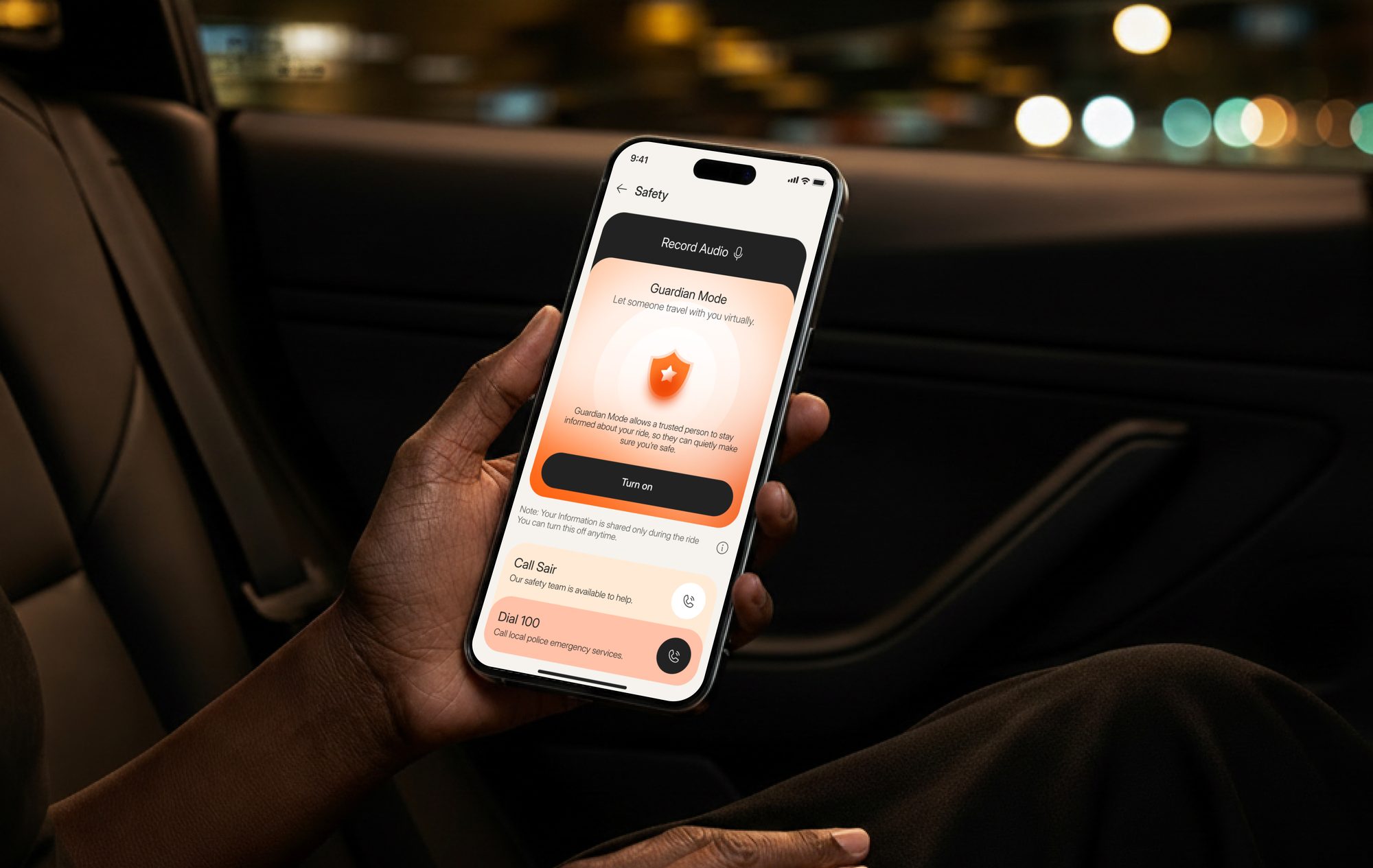
SAIR is a luxury mobility platform focused on delivering a refined ride-booking experience through intuitive interfaces, consistent design, and a user-first approach.
Live ↗Redefining luxury mobility through thoughtful branding and emotionally intelligent UX, creating a seamless digital experience built around trust, comfort, and clarity.
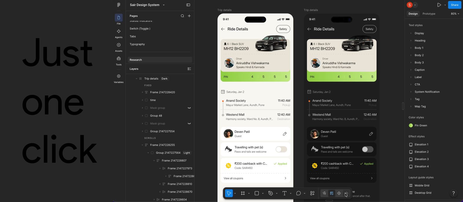
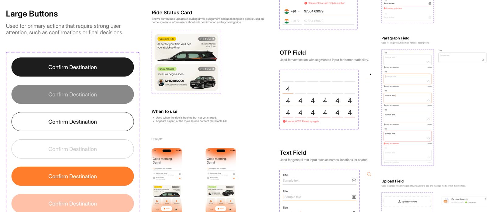
Created my first complete design system, covering buttons, cards, avatars, badges, forms, input fields, calendars, bottom sheets, icons, grids, color tokens, gradients, and more.
Built reusable components, organised color variables, and established light and dark modes to enable quick updates and maintain consistency across the app.
Learned how components, variables, and design tokens simplify workflows, enable one-click updates, and make design more consistent. It was both a challenging and enjoyable experience that strengthened my design system skills.
Process
I created a comprehensive design system that includes reusable components, color variables, design tokens, and options for both light and dark modes.
Explored design system best practices through articles, tutorials, and videos to understand component structures and scalable design workflows.
Investigated a range of colors and created reusable variables alongside color tokens to enhance design consistency.
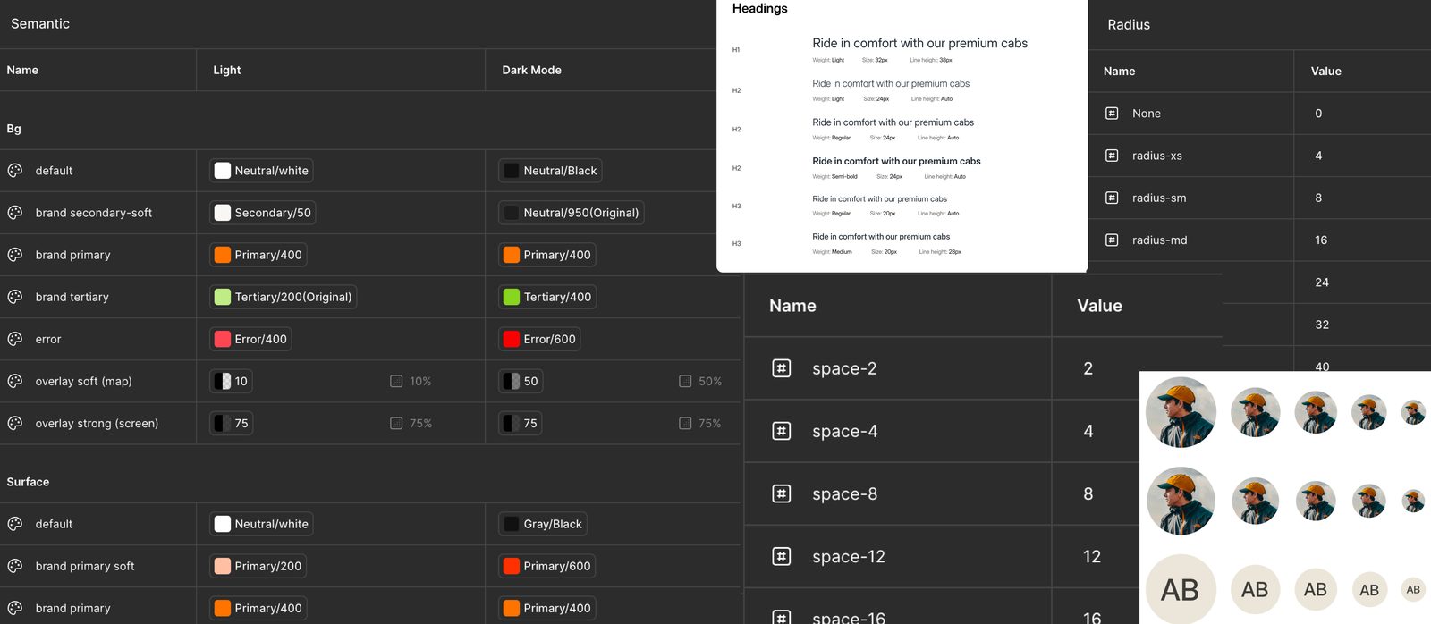
Created a variety of reusable UI components, including buttons, cards, forms, calendars, chips, icons, and more, to enhance user experience.
I established the foundations for both light and dark modes, discovering how reusable components can significantly accelerate the process of design updates.